kennysia.com Is Closed

Update: kennysia.com has finished renovations.
Welcome to the new look kennysia.com!
————————
kennysia.com is closed.
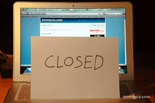
…for renovations. ๐Ÿ˜‰
It should be back up later today.
Meanwhile, please entertain yourself with the wacky bunch of people on kennysia.com Chatbox.

63 Replies to “kennysia.com Is Closed”

  1. The old kennysia.com look is classic, so I don’t wanna change much from there. But you’ll soon discover some subtle differences like comment registration, replying, Facebook integration etc. ๐Ÿ™‚

  2. i still think the older one with one side bar seems neater..cos the sidebar takes up twice as much space as before..
    the main text page seems a lot smaller than it was..

  3. It’s the same size actually! My old template was designed for monitor screens running on 800 x 600 pixels or more. But since most people have bigger screen nowadays, I expanded it.
    I guess it’s gonna take some getting used to! ๐Ÿ˜‰

  4. nice one kenny.. but..
    the link at the archive’s combo box (Got Dust Liaw…) doesn’t seem to work – fatal error.. i think it’s from Oct08, Sept08 and so on..
    categories link are fine but there are errors too when clicking on the link in the category page..
    happy new year! =)

  5. oh yeah, can teach me how to manipulate the template like you do? you’re using php right? great.. coz my html also not so good lol..
    i wanna do my category/archive link like yours too – when ppl click on the link, it’ll show all the titles with number of comments only (without the content).. but i duno how.. cant find any html code for that! lol
    anyway, all the best! =)

  6. Wasting too muh space for the ads on the right. only 3 boxes and the rst of the bottom is empty. I think you should reconsider that part of it. Massively cuts down the space for content…. which is why people come here in the first place anyway.

  7. Wah, you scared me there for a moment! Glad to have you back online! Can’t wait for your next post!
    Cheers & Happy New Year!
    Christine (Perth, WA)

  8. Reply of comment by Kenny:
    “It’s the same size actually!”
    optical illusion due to the double sidebar. I personally prefer single side bar. Now looks a bit unbalanced – for me. Ultimately, it’s Kenny’s blog so HAVE YOURSELF a GRAND time with your new blog layout ๐Ÿ™‚

  9. good work on the new design.
    There is something off on your left and right side border on top connecting the top border.
    sensitive eyes of a designer ;P

  10. Hi Kenny,
    Im a keen reader of your blogs and Im one who likes to click…click… on your blogroll and am going to miss that lots…sometimes I forward some humorous emails that i received from my friend to you, hope you enjoy them and dont mind receiving them at all. Happy New Year 2009 from Brisbane, Australia.

  11. It looks clean.
    .
    .
    .
    But personally, I think it looks a little bit like a darker version of your old blog.
    Annnddddd…..
    (This one velli important question)
    You like blue, don’t you?

  12. agree with above. also that the new layout take up too much space for ad. poor ppl like me still use small screen ok! alright maybe it’s just because i dislike changes =.=
    i love u anyway so pls dont change urself. haha.

  13. Not bad, it looks quite nice, there are changes why still keeping part of the original style.
    Anyway, there’s some problems with the connecting shadows at the top… Plus I think it would be better to balance out the stuffs between the two sidebar. e.g. Put the search at the top of the right sidebar.

  14. Hey! SO hard to get in here to post a comment for you la….but its a good look ๐Ÿ˜€ i need time to do mine also ๐Ÿ˜€ Hope you have a better year to start with ๐Ÿ˜€ take care

  15. new style looks similar to old style. if u didnt tell us i think hardly anyone would notice. haha! change the background colour to… pink perhaps? ๐Ÿ˜€

  16. Scared me after seeing CLOSED sign but relieved now to see a brand new look for the new year. Sincerely wishing you every success and happiness in all your future undertakings! Cheers!

  17. Hey Kenny.
    Your new design look suck!!! Especially the header. The blue BM theme. The only thing that make me smile and loveee it, is your comment section! That is excellent! No double. The rest argh…
    Honestly need my help? i dont mind to do it FOC just for you but just the header section la! something like this blue? Malaysia Web Hosting. After all i am Sarawakian too.

  18. Did you see the blue I showed you? I think that blue is more suitable for your blog but again that is my opinion. That blue is more energetic, lively and outstanding suit your content Man! (As you have many interesting posts) keke

  19. hey kenny
    you rock man!
    xx portrayed you as some kind of loser R-tard so i got curious and came into this site. WHOA!!!!!!!!! you are good!
    you make good political images, got me laughing like mad.
    but thanks to xx you get free publicity. hehe.
    and you are cute .

  20. bro is not bout the better changes..yes it looks better but the ‘feel’ is not there anymore n u cant change that fact..no designs/layout will give the same ‘kennysia.com’ feel anymore. feels im really readin a celeb blogger, which im proud of. but x best alredi la bro..change back la wei, no harm man.

  21. simon is right man..it does looks good with dat blue..wei this gives this damn chun blog even chunner man!
    this one baru betul2 feel!

  22. The banner of the website you show is very normal… Your blue is very bright
    Everyone got different taste bah. Like I like flower banner for my blog, lolz

  23. Should I get a VPS? Currently I am using anhosting but they keep shutting me down because of high server load. Im getting about 2,000 unique views a day. What brand should I get?

Leave a Reply

Your email address will not be published. Required fields are marked *

Navigation