When A Good Layout Isn’t Exactly Important

I’m honestly a little bit that surprised my entry on Blogskin Sins received more backlash than expected.
They said:
“Its their website and they can do whatever they want.”
“Its not for you to comment on their blogs. Leave them alone.”
“Even if they committed those ‘Blogskin sins’. I’m still going to read it if the content is good.”
I say:
“True, I’m not saying they have to change their layout just to suit my taste. I’m just saying if they’re hoping the majority will read their blog with that kind of layout, then they can just keep on hoping.”
Who said interesting content is more important than friendly layout? If you haven’t got a good layout, its gonna be difficult trying to read the content anyways.
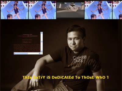
Example of a badly-made Blogskin.

Well, this entry is dedicated to those who think bad Blogskins is acceptable. The navigation buttons are hidden. Good luck trying to figure out where to click. This is also my site and I can do whatever I want, right?
Enjoy.

225 Replies to “When A Good Layout Isn’t Exactly Important”

  1. How long did you take to design that whole site? Teach me. 😛 Haha! I am in a rush to finish my PHP Multimedia assignment.
    Anyway, it was indeed quite annonying and you have proven your theory. 😉 Nice work with that blog and I truly appreciate your hardwork. -lol-
    I have posted another comment at your Blogskin Sins post. 🙂

  2. OMFG
    hahahaha…
    Actually there was a blogger who went mad when I sincerely tell him that his blog is not reader friendly. They are just… forget it
    LOL

  3. i fucking hate u now,kenny.
    u made me listen to the frog (which i thoroughly enjoyed) and reloaded the shit 😛 i watched the damned thing when it was on nokia fones 2yrs ago like,20 times continuosly coz it’s so damn funny.it’s all my cousin’s fault!! really.
    i think i was on drugs then.maybe.
    i dont think u can win this battle. ppl will juz ignore u coz they think their blogskins are the shit 😛
    good luck.

  4. hahahaha…
    freaky ugly layout…
    hope u dun regret…
    anyway… i wonder what to do with the girl playing on the water pipe there with this blog

  5. oh man. i clicked on your COCONUTS. kinda expected it, reckoning your obssession with coconuts. did they hurt?
    and i thought your website was hacked by some morons who can’t design proper blogskins cos of your previous entry about blogskin sins.
    COME BACK, KENNY’S OLD LAYOUT! I FCUKING MISS YOU!

  6. I thought i got to the wrong site. And it took me such a long time to find the hidden navigations.
    Ya, a bad blogskin is truly a sin.

  7. LOL whatthephunk!!!!! never commented on ur blog before, just been a stalker but had to comment this time LoL

  8. i actually trying hovering all over ur blog skin (and you. hehe.) to try and find the hidden buttons. but you prob made them 1mm x 1mm also right? hehehehhee.
    i hate those users who use a really tiny frame on the whole page to write in an even tinier font.
    and there was this time one of my frens put up a whole music video on her blog, and everytime i had to check for new posts, it would start playing, even though it was an old post. bloody frustrating. i thot she would atleast take it off after a while.
    in the end i just waited till she’d posted enough for the stupid video to move off the page.
    but yah i think in the end, they put it bcos they like it. wat to do? :p

  9. nice crazy frog tune!!!
    and i actually had to read da source code to figure out where to go….. sigh… -_-”

  10. nice post! =D my bro had a terrible blogskin and I kept telling him to fix it. But it was his friend’s ‘Free’ design… anyhow it’s not so unfriendly now but still pretty silly.

  11. wah… macam paedophile leh..lol..got the kids pic..lol..i know this layout is temporary, right?..hah, anyways with or without this layout; keep up the good work ya..rock on kenny sia..

  12. i bet the ladies love looking at your sexy bod 😉 nice post man, point made… maybe i should let you look at my blog sometime… 😉

  13. Damn it.. I have a headache and I am giddy .
    U have proven your point. Please spare innocent pple like me who are just here to read the blog…
    Pardon me.. need to go puke

  14. I went to your source to see the hidden buttons as well. Doh. I thought they were all over the place. You should have did that!
    You could have made the font colour bright yellow as well. You’re so nice to not have made the level of annoyance to the max.

  15. Holy Shit!
    For a moment i thought
    (1) your blog got hacked
    (2) you went mad
    (3) your taste sux, and you ARE mad.
    No, i wun read a blog which has bad layout.
    give me a headache.

  16. Kenny, I so agree with you. I really dislike looking for the hidden links and scrolling down on small boxes, having difficulty reading one’s blog content.
    It’s always nice to read a good blog, that has a good layout. Readers won’t be discomforted by the layout’s looks and functions. (Coming from someone who has done Design & Tech at school for 4 years. Woot)

  17. Kenny, that is soooo annoying. U proved ur point but can please revert back to ur old style can? myopia level going up la. hehe

  18. alright, can anyone tell me where are the hidden navigation buttons? kenny, did u put the buttons in ur pocket?

  19. Hrmm…it was kind of difficult at first…tried to select the whole page to see the hidden keys but of no avail…then tried crtl-f and letter “a” and voila! the hidden buttons appeared… :). Don’t like the music though…quite annoying…

  20. nice picture.. bt den.. i’vegiven up trying to find e hidden keys.. so difficult!! tink u’ve made ur point across.. LOUD N CLEAR..

  21. cibai you kenny. ish. thought that i got the wrong site summore. LOL. proving a point huh? how about nice non-criticising readers such as i? kesian lah, subjected to a confusing skin that’s really fucked up. heh.

  22. oi btw i’m heading back on 2nd. go limteh ya. need to catch up with you. there’s so much i want to discuss with you but cannot post up publicly. till then ok? btw i’m fine no worries about aye.

  23. first time commenting, couldnt help it.
    i WAS and still feel annoyed to see bad blogskin layout like yours.:P why make life difficult for everyone? Simplicity is the key…..POINT proven beyond of reasonable doubt…

  24. excellent way of proving yoru point.
    dumbasses who think a bad layout is fine must have no designing skills whatsoever and resort to being sour-grapes.

  25. the frog is sooo annoying… but anyway.. like people, inner beauty is what make a person beautiful. i guess it also apply to blogging as well in having a good content… bla.. i dunnu what im talkin about….

  26. After reading your blog for quite some time, I didn’t have to stop to ponder to think where your navigation buttons might have been hidden. I got to your entries on the first click. 🙂

  27. when i first loaded the page with all those lil’ girls splashing down the pipe, my first thoughts were… “omg, kenny got fetish”, but i’m sure everyone agrees the beverly hills frog song is damn cun. =)

  28. OMG, you scared me man. I was like ‘Whattt?’
    But then after I clicked on the comment button I was like ‘phew…’ 🙂

  29. Nice pic and good point.
    NOW CHANGE BACK TO THE OLD kennysia.com!!!
    I almost ripped out my hair while trying to find the navigations~~~~!!
    =(

  30. hey, you know, that layout would have been brilliant if you’d put the navigational buttons on diferent parts of your body… then people would have to click your mouth for food reviews, click your eyes for book/movie reviews, your heart for personal entries, etc.
    Those woh want to flame or insult you, have to click your ass.
    and those who want to see the naked SPG phots, have to click er… down there.
    HEHEHEHEHEHE

  31. I am strangely enjoying it, hunting for the hidden craps as annoying as they are. I am sure you have just as much fun creating it.
    If you were to settle for something routine, entirely predictable you might as well be …err.. having no blog, and especially for one just recently been certified the biggest coconuts of all. I hate to put down other bloggers, it is this kind of entry that will put them to shame, and it is so true. Just look around and you kind of know what to expect before even hitting their sites, day after day, year after year as if they are never quite having the umph to try something new, fun and refreshing. (btw, sheep are excused for not trying.)

  32. omg.. i want the original kennysia layout back!
    nice point made, but it’s torturous to search for the hidden navigations.. =|

  33. Finally..i get to see again…i can’t even typed properly in the chatterbox…yikes..
    Good job on proving your point. I’m one of those people out there who disapprove of this kind of bad website design, although the frog song is cute..haha
    Do return to your old layout. That’s YOU..not this..^o^

  34. I was just about to go straight to the “view source” page when I noticed the comments page brought me here….
    You ass, NEVER DO THAT AGAIN!

  35. Kenny!! For a moment I thought your coconuts really swell up so huge that hinders your normal thinking! I was fantically clicking on different parts of your body to get me back on track again….
    You have proven yoour points 😛 & I’m so glad to be back on heaven again! AHhhh……!

  36. hahaha.
    i actually like the crazy frog song you know! (x
    well,to be truthful,most blogs with hidden buttons arent as hard to find as yours.
    but anyway,please change back asap! ):

  37. Wow…U’re GOOD !!
    *impressed*
    I love this entry !! Think it shld be the “entry of the year”. Funny n creative, yet at the same time send ur msg right across !! Classic

  38. Well done, Kenny. I see that you have proven your point well! 😀
    Owh I hate Crazy Frog…
    I almost panicked there for a second when I couldn’t get my PROPER dose of Kennysia.Com and it’s oh-so user friendly layout.

  39. I dun usually comment. But this 1 darn Hilarious. But the most importing is you u say thing u prove it to with his hideous and annoy layout. Well done really true to ur words

  40. ur frog song drove me crazy & i wanna puke now. i totally agree with u, point taken! argh. enough IS enough. i clicked everywhere! *sheesh* talk about bad website designs. haha. i really thought u changed ur web design. freaked me out nonetheless.

  41. LMAO!! yes this indeed annoying:P:P you got your point across kenny! lol. I thought the hidden buttons were in your picture so i just kept clicking in the area of your balls but nothing happened. *tsk tsk*, I would have thought you’d do that =P. I read your entry, I’m not sure how I got there and I’m not sure how I got back to the main one. very confusing =P. lol, seriously, we get your point kenny, but see this is why you’re so popular, who on earth would actually read someone’s blog who was actually like that EVERYDAY =P. anywyas, gtg… sweet & sour dayz, hoep it’ll chnage back soon. hehe!!

  42. Kenny,
    See your face hor make me vomit out my Char Koay Teow in the morning …
    KNNCCB, make me wasted me RM 5 char koay teow … !@#$%^&*

  43. KENNY i love your blog! and we share the same birthday lol. i didnt get to hear the crazy frog!!! (which is a good thing cos im supposed to be writing my thesis and my dad would come storming in knowing i wasnt studying!)

  44. not bad lar kenny..
    at first i really hate that song
    but after entering your blog, i find it very cute and nice =)

  45. haha! This entry almost got me rolling on the floor. A superb, effective and hilarious way to get your point across. Keep up the great work, love reading your blog! 🙂

  46. you sneaky guy… place one of those navigation buttons on your COCONUTS!! wahahaha. i found others on your nose and the calvin klein logo… *grins* the song’s actually quite catchy after a while.. =P

  47. Im using Firefox and my extensions actually block unfriendly weird popping flash embeds, java script, java applets and other funny embedded tags (like music, etc).. So its all safe surfing for me (but I didn escape your layout tho.. lol)

  48. woah! this entry has certainly scared me… i thought you kena hacked SIA… lol~ You have gotten your message across… can we have the nice old kenny back please?

  49. one word for it —> astagar!! (taken from some indo drama)
    Thats most horrible design!!! even got annoying frog too. Bah!!!
    I’ve think we get your point in your last entry.
    That would be a lesson for us in designing blogs.

  50. (refers to my last post) I just realised I did do it right! It was your balls after all! LOL. You know your layout atcually doesn’t annoy me =P Although my mouse keeps sticking so it was realllly hard to scroll and move the pointer over the place =P Does it give you a high at the thought of people continuously clicking you *there*? LMAO. anyways, this was hilarious!! It really did grow on me eventhough I normally hate blogs like that. Is that girl your cousin or something? Did you get it from blogskins.com? I would have though using her owuld be illegal withotu her permission or whatever. I stared at her for ages! you know how you soemtime stare for a long time evnthough it’s a repetitive motion? =P the slide looks so fun, eh? i want to slide also!!! sadly…gravity is not on my side… sweet & sour dayz =P

  51. seriously.
    enough with the layout.
    We get your point.
    Everytime I open firefox its that stupid song.
    Please Kenny.
    You’ve made your point as clear as day.
    The novelty has worn off.
    It is now very annoying.
    Please don’t out it up as your main site anymore.

  52. lolx!
    Your point is hit hard and to perfection! What a slap in the face for those who committed the Blogskin sins.
    now please spare us innocent ones…revert back to normal!

  53. wOi, YoU FoRgOt To TyPe LiKe ThIs!!!
    TyPe LiKe Dis Is CuTeSy. SpEeLiNg WrOnG OsO CuTe.
    ReDo YoUr LaYoUt.
    whoa, that took 3 minutes for me to type.

  54. Hoho. Pity your loyal and supportive readers like me! Had a hard time reading it! Well, people just won’t accept the truth lar. They’ll only accept good comments. And the word ‘Leave a comment’ actually means ‘Leave only good comment, bad comment will be deleted’. =P
    To them : Stop cheating yourself. You can’t make everyone likes you or your stuffs. It’s doesn’t matter, anyway, right?

  55. wow!i think you are very creative! i totally agree with you that BAD BLOGSKIN irritates me to the core.. gosh. the tiny blog space and we need to scroll from left to right.. haha i guess you are trying to convey this message to the rest by letting them have a taste of their own medicine right.. SMART! bravo! i like your site.. creative~

  56. HAHHAHAHAHAHAHAHHAAHAHAHHAHAHAHAHAHAHHAAHAHAHHAHAHAHAHAHAHHAAHAHAHHAHAHAHAHAHAHHAAHAHAHHAHAHAHAHAHAHHAAHAHAHHAHAHAHAHAHAHHAAHAHAHHAHAHAHAHAHAHHAAHAHAHHAHAHAHAHAHAHHAAHAHAHHAHAHAHAHAHAHHAAHAHAHHAHAHAHAHAHAHHAAHAHAHHAHAHAHAHAHAHHAAHAHAHHAHAHAHAHAHAHHAAHA!!!
    so farnee
    nowhere to click, repetitive videos, irritating song + narcissistic self pic!
    3 thumbs up

  57. kenny sia!!! u make me squirm my eyes to read those bloody small words and those pop-ups too!!! arrgh…u’re too right. i bloodily hate those kind of blogs.

  58. YOU MADE MY DAY!!! *thanks*
    sorry for MOLESTING you just now, i kept clicking here and there on your body to find those hidden buttons… *sorrie*

  59. i opened this site three times using different wireless connection to see the site in its fullness.
    i just got your point.
    n i love the new format! wahahaha. esp the frog.
    great job done.
    wahahaha

  60. hahahahaha! i actually LIKE your new layout cos, heck, everytime i see it i fall off my chair laughing…
    couldnt find the last button til i decided to click on your famed coconuts. LOL.

  61. gosh…at one point, I thought your site was hacked (like what happened to XX). But then again, when the pop ups came up, I think everything was ok. Hehe.

  62. hahaH!!! g00d on3!!! bet loADS of peeps ‘molested’ u though, with the hidden butt0ns n all! nice work…. salute~ cracked me up good- =)

  63. lol it really is annoying… u really proved your point. tho i hope u won’t leave it this way for too long. haha

  64. haha…ur dick is actually one of the hidden navigation button….good one….u proved ur point. However as most of the blogs only have one of the features you said, so give them some credits.

  65. gosh…it give me a shock… i tot ur site was hacked… lol…hell i can’t find any hidden link at all…n those words u put is darn small to read… really crappy blogskin…lol…u’ve proven ur theory …^^

  66. Layout is of the utmost importance when it comes to websites. It’s a first impression which you give to your visitors.
    Fucked up layout and you fuck off your visitors.

  67. OMG.. i don’t comment generally.. but my first thoughts are the video of the CHILD going down the water slide.. is that a bit paedophilic or what?! Please take it off it’s disturbing.. point made 🙂

  68. New CK Model…shold place a big billbord in Jalan Bukit Bintang Street….Sarawak Boleh..Malaysia Boleh and Kenny Boleh

  69. i didnt reliase how much u loved sex
    “LoVeS
    SeX
    FoOd
    sEx
    BeEr
    SEx
    HaTeS
    NoT EnUff
    SeX!!!
    Wants
    iPoD
    anD
    (make a guess?)
    (correct!)
    SeX!”

  70. im a silent reader of ur blog..but i muz say ur “modified” kennysia.com turned my bad day into a better one immediately. haha. but once is enough seriously. =)

  71. I almost choked on my food as I just couldn’t stop laughing upon seeing that new layout of yours… haha! hope it is just temporary. seriously speaking, your old blue & white layout is a hundred times more reader friendly 🙂

  72. nabehh lah kenny! u making fun of blogskins right?!! ok ok i got ur point!!
    so you DO know pop-up boxes annoy ppl.
    -_-||

  73. HAHA! this is great!
    wonderful in your face approach to the act-stylo, act-chic kinda blogskins.
    but omg, for a second i thought you were really gonna use that skin.
    but great idea anw. hahaha.

  74. ehhhhhh not fair wei!! how come i didnt hear any frog songs?????
    babi i was damn scared just now coz i thought u kena hacked as well.
    so deliciously sarcastic.
    can i please join the “I want to marry kenny!” line??

  75. Just one suggestion.
    can we request blog skin advice from you.?
    You just need to blog about our blogs and give tips on how to improve the layout… of course with our permission first lah
    *2 thumbs up*
    – Life Feel

  76. This blog is creative, but creativity doesn’t mean passing off rubbish as art. By the way, the layout is freaky… the girl who keeps coming down… the horrible frog and now… your entire person!
    Maybe u can lose the weight first to look less like a hum chim peng… LOl!!

  77. Whoa i am so happy when i finally see a new skin u know, i prefer this then the one one! Tot you finally become artistic until i read the msg..haha just kidding :p

  78. re:jasper’s comment
    wahahaha, now that the secretis out, people will be clicking like mad on kenny’s koogoo hahaha

  79. coolness! the ridiculousness of the layout with me hovering my mouse everywhereeee looking for something to click with the annoying frog serenading me in the background! 😀

  80. I believe that most blogskin was chosen to reflect the author.
    A black with red font might express extreme belligerence. Just as your new layout expresses annoyance.
    I do however steer clear of hard to read blogs. But in the end it’s a matter of personal preference, the author’s purpose for his/her blog and the blog’s intended audience.
    Just IMHO. Love your blog BTW.

  81. Wow…that layout is really an eye-sore..sad to say..i prefer the previous one.And gosh..Crazy Frog?hey dude..Think of a better tune man..

  82. love the frog, hate the frog, love the frog, hate the frog, love the frog, hate the frog, love the frog, hate the frog, love the frog, hate the frog, love the frog, hate the frog, love the frog, hate the frog, love the frog, hate the frog, love the frog, hate the frog, love the frog!

  83. well,
    i agree, i hate certain aspects of annoying blogskins. (like a small text box, with a LARGE photo in it/songs embedded onto the page/too many annoying pictures)
    but it’s true, it IS their blog afterall.
    and not all of ’em may want their blogs to be famous. 🙂
    but your point was made.

  84. Why are these ppl calling me a paedophile when there’s not even a naked photo there? Kids are supposed to be innocent. They’re not even remotely sexual if you don’t think of them as sexual objects, you FREAK.

  85. omg… i thought i went to the wrong site …
    true enough, they may do whatever they want since it’s their blog.. but if they had some senses … they wouldn’t …
    it’s all about preferences i guess..
    and oh yeah, the layout’s horrible..

  86. omg… i’m getting blind and deaf… too many repeats of the song and can hardly find the buttons to yr blog!

  87. Well Kenny boy, been reading your blog and I must say, sticking your nose too much into other’s window is bound to get a swat on your face. That’s how it goes in this blogosphere thing so you should have anticipated for the “backlash”. Tired of all these overwhelming attention and praise? Vain glory I must say.
    However I do agree to some extend of bad layouts and content but again, if you criticise and try to make your point to the readers, you get answers, good and bad. Niway, I’m sure there’ll be lots of comments on your photography and such.
    You should just make peace with others and stop being such a snob nitpicking at shop signs and little things that I don’t see how these can harm you.
    Cheers;
    The Singapore Bastard!

  88. Russel, no worries. 🙂 There’s a difference between flaming and criticising. I can take a lot of criticisms, and besides – they’re not that much anyway.
    The “backlash” I received are not so much by the Blogskin designers but by vincent and eyeris, both of whom I’ve chatted via msn and stuff. As for the remarks about me being fat, hey at 84kg I admit I am. Doesn’t bring me down.
    I do however have to say I disagree with you saying that I’m “a snob nitpicking at shop signs”. No, of course they don’t harm me, just how like learning Greek mythology in highschool doesn’t benefit me.
    I just find them interesting that’s all. And that’s why I commented.
    Cheers,
    The Kuching Bastard!

  89. my online friend’s blog … at blogspot.
    not sure if she installed a Counter.. but i think it’s an example related to this entry by Kenny(Sia).
    but please leave nice comments ?
    lifeofdarkie
    blogspot

  90. Kenny dude, now “greek mythology” is disparaging. Anyway, that’s you and your blog. I need to thank you at the same, the article on harmony NS for our research on Malaysia’s NS stuffs 😉
    Cheers;
    The Singapore Bastard(s)

  91. A ring ding ding ding ding
    A Ring Ding Ding Dingdemgdemg
    A ring ding ding ding ding
    Ring ding
    Baa-Baa
    Ring ding ding ding ding
    A Ring Ding Ding Dingdemgdemg
    A ring ding ding ding ding
    a Bram ba am baba weeeeeee

  92. nyabeh….your blog is cool man…but ur that stupid frog song memang celaka…but however…your blog always rules…

  93. The new layout is no doubt very creative but not so user-friendly, especially for a middle-aged woman like me with poor reading vision. Pleazeeee… Kenny Dear, revert to bigger fonts — tolong-tolong lah !

  94. Wah, don’t need to punish us who agreed with you on the blog sins. Coz after all, the majority agrees with you. Shouldn’t have given them the satisfaction of your retaliation.
    Poor us.

  95. Wah! freaking lots of comment for this one. Tought your site is being spam with comments. Anyway when I wanted to add another comment I saw this “http://www.kennysia.com/archives/2005/08/when_a_good_lay.php#comments”
    Notice anything? when_a_good_lay.php. So I am suggesting maybe on your next blog you can write about – getting a good laidout, laidout for beginners, where to get the best laidout, etc..lol
    Cheers

  96. Wah!!! I hate your site!! Give me back my old kennysia.com! >_Wah!!! I hate your site!! Give me back my old kennysia.com! >_

  97. DAMN~!! lucky i don’t have the plugin to have to listen to that fugly ah beng’s crazy frog song!!
    yeah, i hate stupid blogskin too. And i thought that u had gone to the dark side of blog (nerdy joke.chuckle!) until i read it (hardly). Pheww~~
    damn u kenny (its like damning myself.. O_O) for having me click on ur coconuts for several minutes trying to go in ur site.. hope that the coconuts are bruised now from the amount of clickings from ur fans.. >__DAMN~!! lucky i don’t have the plugin to have to listen to that fugly ah beng’s crazy frog song!!
    yeah, i hate stupid blogskin too. And i thought that u had gone to the dark side of blog (nerdy joke.chuckle!) until i read it (hardly). Pheww~~
    damn u kenny (its like damning myself.. O_O) for having me click on ur coconuts for several minutes trying to go in ur site.. hope that the coconuts are bruised now from the amount of clickings from ur fans.. >__

  98. quote kenny: “Why are these ppl calling me a paedophile when there’s not even a naked photo there? Kids are supposed to be innocent. They’re not even remotely sexual if you don’t think of them as sexual objects, you FREAK.”
    totally agree with you, kenny. they are damn freak all through and through. when i read one of those comment, i was so shocked. WTF? just a picture of a kid in swimming costume on a water slide make them think of sex?? freaky!
    when you put a picture of a kid – they cry paedophile.
    then if you put a picture of a sexy busty lady in bikini instead – they will cry porn.
    so you thik better put a picture of a good looking man in his skimpy swimming trunk – then they will say you are gay.
    *BIG SIGH* blogitics, kenny, blogitics.

  99. no doubt it other people’s blogs that u r commenting on… they are entitled to do whatever they like in their own space.
    and here is your blog, YOU ARE ENTITLED to COMMENT whatever you like in your own space.
    YOUR OWN OPINIONS.
    Bad blog skin suxs!

  100. y u want to compare ur blog to other ppl?
    got 1 story i don’t know u heard b4 or not..
    don’t try to compare with a rabbit.
    because if u won the rabbit it only show tat u r clever than a idiot.
    another way round if u lost to a rabbit it only show tat u r much more lousier than the rabbit.

  101. KENNY SIA!! YOU WERE CRAZY!! THE DAMN BLOGSKIN WITH CRAZY FROG GAVE ME MIGRAINE EACH TIME I LOAD YOUR PAGE!! and when i tried to click on comments, IT HID!! WTF..

  102. When you put a picture of a CHILD IN BATHERS on a site with a HUNK posing like a porn star… do you TRULY not expect paedophilic thoughts to not go through anyone’s head?

  103. pv_ice D4 WaY T4T U TyPe Ur CoMmEnTZ JuZ MakE5 U SoUnd Ev3n M0re ImMaTuR3 dEn Yu ReLlI R, U N03 WaD I MiN?
    WaD RaBbIt HeRe RaBbIT ThErE…
    I aSk U U GoT HoW MaNy HiTz 2 Ur SiTe EveRyDaY HaR?
    ToK So MuCH.
    Bah. Go study. Grow up. 😛

  104. Woop~! I am soo clever!
    LOL. I managed to find all your imagemapped links! LOL…right eye, mouth, left ball, calvin klein, etc..
    I got blind reading the entries…

  105. Somehow… when you said to look for the links and good luck,
    the first thing i did…
    was to scroll my cursor over your erm private bits bwaHAHAHAHA
    (thought you might* have hid them there but i guess not)

  106. Think there is no point leaving comments in your blog now since there are more than 200 already. My comments will get buried……….

  107. geez, the first impression wasn’t the blog layout, more like it made you look like some pedophile with the pics of the kids in trunk and with your eyes staring as if you’re up to somethin evil. 😛

  108. I hope there’s more ‘real’ bloggers out there like you. Good job in bringing up different issues everyday. Your site, is a must-visit everytime I’m online, even my bf who’s in Aussie got addicted to it after I shared one of your post with him.
    Have a nice day.

  109. OMG!
    Hahahahah…..
    Your new site is fcuking annoying man!
    Hahah… the stupid song is so addictive and nice pop-up u had there! 😛
    U rock! hahah…. I think u made ur point very well to those blogskin “sinners” ;P

  110. A**hole… I was trying to find the hidden buttons… I kliked ur head…ur chest n i tried to klik on ur tummy…ntg happened.. When i kliked ur…**** …………………………………………………….

Leave a Reply

Your email address will not be published. Required fields are marked *

Navigation