Every now and again, I’d do a bit of surfing to find out new and interesting blogs I could add to my bookmarks. There’s a lot of good blogs out there and its easy to be impressed not just by the quality of their content, but also the amazing design and layout some of these blogs have.
A lot of blogs use templates from Blogskins.com, and surprisingly many of these templates were done by 13-15 year olds. Seriously, their web design skills kicked my ass so hard, they made me looked as if I designed kennysia.com half-heartedly with my mouse clenched between my buttcheeks.
But those are the good ones. The bad ones, mannnn… they’re not just bad, they’re nauseating. If anyone reading this is using these skins on their blogs, don’t worry I’m not dissing you. Your content may be good, but PLEASE, do yourself a favour, give yourself a tight slap across the face and change the skin lah!
Here are some of the worst sins a Blogskin designer could commit.
1. Don’t force us to listen to your crappy music.
Blogs with background music are as invasive as having a stranger sticking his finger up your nose. If we want to listen to music while blogsurfing we’d have played Winamp. And if Winamp was playing when we dropped by your page, we’d be forced to listen to a collaborative remix between Norah Jones and The Crazy Frog.
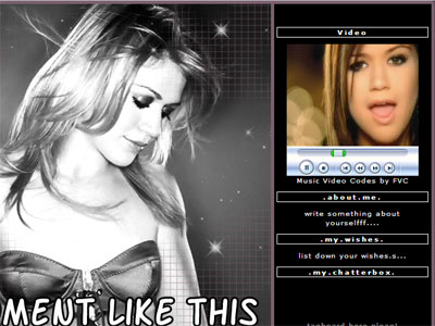
Come on! Why would anyone have MP3s that autoload on their blog? There’s even this skin that autoplays a whole freaking music video. It’s annoying, it catches us by surprise, and by the time your blog finished sucking up all our bandwidth we would have reached for the bright red ‘X’ button on the window because we couldn’t find where THAT GODFORSAKEN STOP BUTTON IS LOCATED ON YOUR WEBSITE.
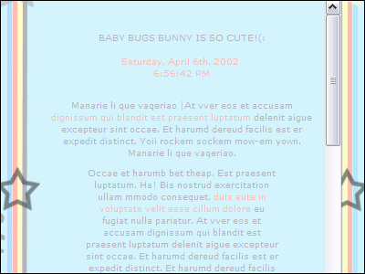
2. My screen is 1280×1024. Your entries are in a 40×100 frame.
Blog entries written in frames effectively kill the use of my mouse’s scroll wheel, but generally I’m still quite cool with that.
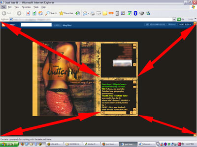
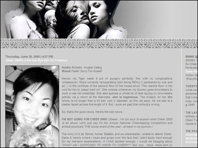
The blog entries are all in that little frame there. All the surrounding spaces = wasted.
Lately though, the frames been getting smaller and smaller and the background images (ranges from anime characters to random girl in provocative poses to some lame-ass celebrity like Britney or Avril Lavigne) just keep getting bigger and bigger. It comes to the point I’m staring at this picture and the blog entry constitutes just 10% of the my entire screen’s area. Worst of all, these entries are usually written in xxx-small fonts and in colours so bright they could make a blind man see again.
Please. We’re here to read your words, not look at your stupid background images.
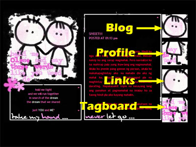
3. Hidden buttons are not cool, they’re irritating.
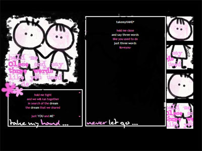
Cute, but… dude, where’s the blog?
It’s bad enough having to click an extra button just to get to your profile, links, tag-board, entries. You could at least make our lives easier by TELLING US WHERE THOSE BUTTONS ARE.
4. This wouldn’t have happened if they’re told the readability of their fonts is related to the size of their balls.
Sometimes I think these people design websites not for humans, but for ants to visit.
Try reading this without leaning forward.
How the heck am I supposed to read these words? I practically have to kiss the computer screen to be able to read what they wrote. Yes I know I can manually set my fonts bigger, but why should I? For God’s sakes, make your fonts larger.
I just want to read your blog, not go for a bloody eye examination.
Finally, to be bloglitically-correct, I must say this, “Its your blog and you can to do whatever you want.” 🙂
I’ve received a lot of e-mails from people who are in the same predicament as I am following the entry on my Kuching/Perth dilemma. I’ve read through all of them and I’m grateful for the personal stories you shared as well as the words encouragement you all gave. I wish I’d be able to reply to each and everyone of them personally, but that’s quite impossible. In case you didn’t get my reply, please do accept my heartfelt thanks. 🙂