Bad Malaysian Government Websites

I’m flying off to Sibu, Sarawak in 2 hours time for a business-related trip. I’m coming back Tuesday morning, which meant I won’t be able to log on for two evenings. Damn I’m gonna miss the Internet. Nicole once said to me after I repeatedly failed to fix up her internet connection, “I feel so handicapped without the internet!”. Now I know how she felt…
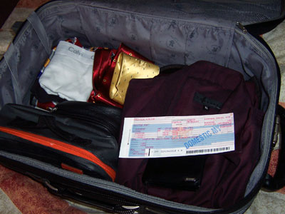
Bags

Contents of my luggage: toiletries, business wear, casual wear, ties, undies, and if you see carefully: the infamous red Daffy Duck boxer shorts.

Its my first time going to Sibu, so I’m actually looking forward to it. All I know about Sibu is that its the third largest city in Sarawak after Kuching and Miri, and is home of the Foochow’s kampua mee.
Oddly enough, I met more Sibu people when I was in Perth than I did when I’m in Kuching. To me, the Sibu people I know came across as plain, quiet, hardworking and innocent. They live a simple lifestyle: wake up, work, go home, eat, sleep – its the kind of lifestyle conservative Malaysian parents would approve of. Sibu people don’t care a lot about making up, wearing fashionable clothings, trying to look good or what not. Its either that, or they tried… but failed. Just kidding. 🙂
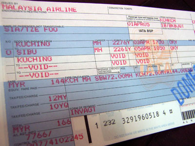
Ticket
Anyway, to prepare for my trip to Sibu I googled ‘Sibu Sarawak’, and out came the official Sibu website at www.sibu.com.my.
Welcome page

Don’t ask me why its sibu.com.my and not sibu.gov.my.

I was greeted with the above welcome page. I hate welcome pages for a reason. Welcome pages are ok if there’s more than one link on that page asking you to select your country/language/whatever. But in most cases, there’s only ONE LINK on the welcome page. Its an extra work for the webdesigner to create, and extra work for the websurfer who have to click on that ONE link on that page to get to the information they want. And for what? To look at some pretty graphics? Pfft.
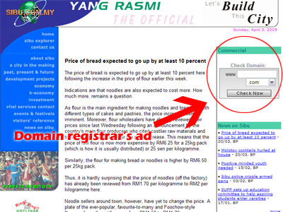
Hijacked for commercialism

The blurred line between a government website and a commerical website.

A minor crime they committed is to allow the webdesigner to hijack the website by inserting their domain registration services on the main page. Entering anything in that box will teleport you to the domain registrar’s website complete with bad Flash plugins and horrible mouseover sound effects. But funnily enough, I’m ok with having links to commercial services on a government website.
What I can’t stand is this… ANIMATED GIFs.
ani_together.gifani_sibu_globe_mini.gifani_hotlines.gif
God dammit. Stare at that animation for five minutes and tell me you’re not going crazy. The Sibu website is not the only one. It seems like all government websites across Malaysia are obsessed with bad animated GIFs and bad Flash intros. OBSESSED!
Example, JPJ Wilayah.
Go on, click on that link. I dare you. Turn your speakers up loud.
I swear you’re gonna have that tune stuck in your head for the rest of the day. It happened to me. Now I feel like doing a cute little Malay dance everytime I hear that tune.
Any more bad government websites to share? Let me know. Meanwhile I’m off to the airport. See y’all in 2 days!

30 Replies to “Bad Malaysian Government Websites”

  1. Good luck in your business trip to Sibu. And oh, hope to see more pictures of Sibu and some interesting stuff you found in your trip. Looking forward to it. 😉

  2. Hey Dude that’s the Rm 80 Underwear for you Gold Kacheng, no ? I was bored at work today…surfed you old posts.

  3. That’s So, so, sadly true.. It’s a shame on us Malaysians. Just look at Singapore’s .gov websites, every one of them looked so professional and are updated daily. Sometimes I wish I have the time to volunteer to re-design all Malaysian .gov websites. Not one are worth mentioning. sigh.

  4. I know of the fact, and it is rather sad.
    Why don’t those in the know come up with some solutions, post it to anyone who might be able to use it.
    Better still work up a rival proposal website. Try posting it on the free webpages and try to get more visitors.
    Good luck,
    mamatd.

  5. I’m afraid I’ll have to disagree on animated Gifs. I for one have excellent examples of superheroes in tights dancing and swaying gracefully, or line dancing.

  6. HOLY CRAP THE JPJ SITE
    O_O
    My god, what a disgrace..Definitely not something to keep in a portfolio. Pfah, who the hell did that? Shoddy job.

  7. Hahaha! If I am not mistaken animated GIFs went out of fashion circa 1999. Actually my first webpage back in 1996 has animated Dragon Ball characters. What a fool I was back then.
    Only Malaysia governments would still employ them…how true…

  8. strictly speaking, kennysia.com is misleading too right? it aint a commercial entity, ok, arguably yes as you generate revenues with the google ads.

  9. My god….dunno how i get to ur blog but u are really good!
    Very funny!!
    Ur april fool’s joke is a good one!!!
    I will put in my very best next year.

  10. oh yah..the m’sian gov site…just by thinking about it will make me puke. It’s not a web design at all. the person who did it,is either a bad designer, or a bad programmer. One thing about the gov project, they never get to the one who deserve to design it. the contract always go to somebody’s somebody. may be when they have the meeting, someone said, oh my nephew ah, he internet a lot, irc lah, chat lah. he can do it.
    they dont know what is web design ..
    btw, i’m a web designer… lol

  11. Being a web designer myself, I can’t really see one positive point of those websites that you pointed out. Poor design, poor usability, and I wonder why Java is used? Can’t agree more to what yellow ant said. You probably have to be somebody’s somebody to land yourself a govt. project. 😛
    Btw, have a great trip!

  12. Jason, thanks. I got lots to share. 🙂
    Jayelle, hahaha! I see animated GIFs! My eyes, my eyes!
    e, you spotted that one right. 🙂 I’m glad my old entries aren’t gathering cobwebs.
    ember, I’d help them redesign the website, but not for free since the government is loaded with tax payers’ money anyway (teh tarik in space, anyone?).
    Chrissie, OF COURSE MY UNDIES ARE CLEAN!
    mamatd, that would require someone patriotic to do so. You mentioned “those in the know”. The sibu.com.my website is actually done by web designers who called themselves Sarawak Internet Professionals.
    Lainie, the only good thing coming out of that JPJ Wilayah website is the music. Never fails to cheer me up everytime I feel down. 🙂
    Jon, heh, sounds like we are all guilty of something!
    Wilson, I’m afraid its not something I’m ready to reveal on this site. Perhaps I’ll let you know if and when we happen to meet up. I’m sorry, I hope you understand.
    killerkai, I thought kennysia.com sounded better than kennysia.org!
    Adam, I prefer to travel light. Some clothes can be worn twice.
    L, I appreciate it. Keep coming. 😉
    IngHui, I miss you too! haha… yea I fixed the link. Damn, where have you been?
    Koh Lee Onn, eyyyyy! Sorry yea, gotta edit some words out. But if you know me, please keep ‘the extra information’ you know about me to yourself, alright? 🙂 Trying to keep a low profile here. That way I can continue writing and you can continue reading my site freely. Many thanks!
    Poi Poi, you’re gonna rival me? NEVER! 😀 Well, I sincerely appreciate it.
    N, I think you nailed it square on the head. The problem is: all these big shots high up wanted an government website, but doesn’t know what makes a government website good and usable. The web design consultants ripped them off and they don’t even know what hit them.
    Ivan, funnily if I turn the clock back 10 years time, I’d probably think that the website is pretty good. The JPJ website is done using Microsoft Frontpage 4, so go figure. 🙂

  13. That is what we call by showing off…our stupidity…and others just watch in silence …and laugh in their hearts…

  14. i never liked going to the goverment dept …
    it’s just such a hassle to do anything relating to them these days . . .
    Is it my fault that they take the whole day ?
    to update my IC ???
    sheesh !

Leave a Reply

Your email address will not be published. Required fields are marked *

Navigation